There are hundreds of features that could be described here. Rather than dive in – encyclopedia style – let’s take a look at a few examples that illustrate the style that FleetCaptain uses to convey information.
Every effort has been made to provide an intuitive interface that anyone can grasp quickly. A novice user will find the system easy to understand while an advanced user will have all the power needed to get the job done.
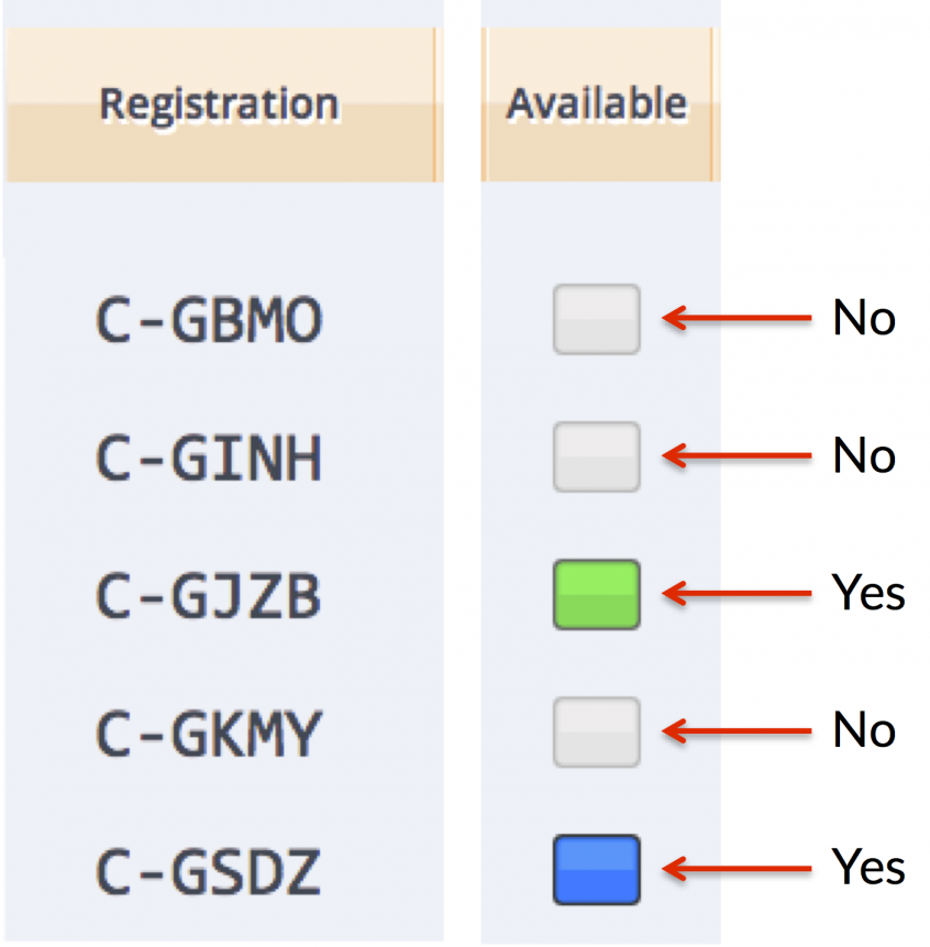
Is this plane available?
If the light is lit the plane is available. No light means the plane is not available. Why the different colours? The colour indicates the aircraft weight and balance category. Blue means normal category and green means utility category. Sometimes the light will be split – half green half blue. That means the aircraft is loaded to depart in the normal category, but will transition to the utility category when a small amount of fuel is burned.
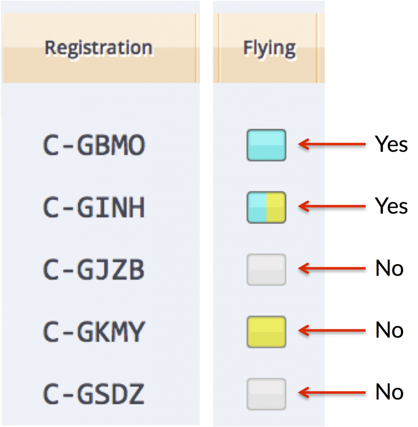
Is this plane flying?
If the light is lit sky blue, the plane is flying. No sky blue? The plane is on the ground.
So what’s the yellow? Yellow indicates that at some point in time, the plane has been embargoed – reserved for a pilot during a specified period of time. Normally there is no reservation and the system selects a plane when the pilot is ready. But if a pilot needs a particular aircraft, perhaps for a flight test or an IFR flight etc. the embargo ensures that the desired plane will be used normally until the embargo time, then will be held back for the pilot who has requested it.
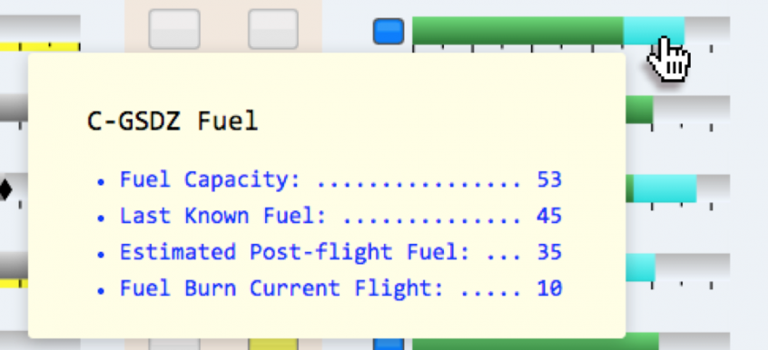
More details quickly!
Hover over buttons, lights or gauges to get more information from a pop-up tooltip.
You’ve now seen about 1% of FleetCaptain’s functions.
FleetCaptain was designed to go beyond supporting operations – it will enhance the staff’s efforts and stimulate their creativity. Feel free to use the contact form on the contact page if you’d like more information.


